Video hero
The Video hero section is a bold, immersive banner that uses autoplaying video as its background. It's ideal for creating a dynamic first impression or showcasing movement, mood, or lifestyle in a way static images can't.
Settings
| Setting | Description |
|---|---|
| Color scheme | Select a predefined color scheme. The background color is used for overlays. |
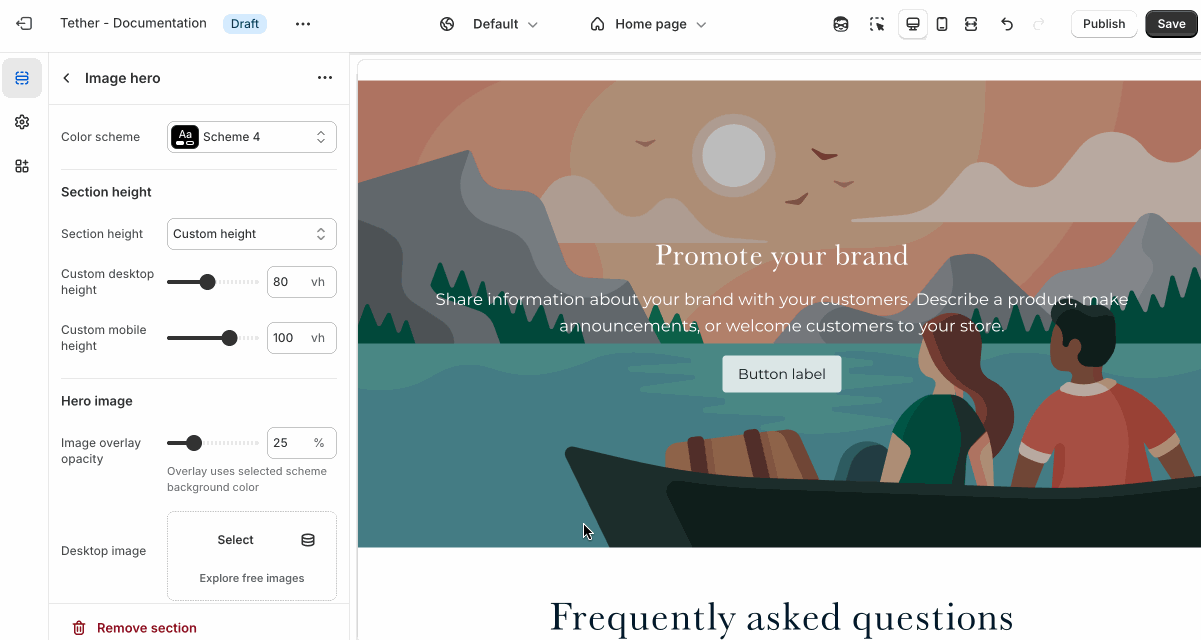
| Section height | See shared settings > Section height. Associated settings below. |
| Video overlay opacity | Adds a semi-transparent overlay on top of the video using the selected scheme background. Use this to improve text readability. |
| Video | Select the default video. |
Mobile video * | Optional. Upload a different image optimized for smaller screens. If left blank, the desktop image will be used on all devices. |
| External video url | Use a video already uploaded to Youtube or Vimeo. |
| Poster image | A fallback image visible for devices that block autoplaying videos. |
| Section animations | Animate section when scrolled into view. |
External video sources use fixed aspect ratios. Section height being set to Video height is highly encouraged for external media.

Shared settings
These settings are common to several sections and work the same way wherever they appear. Once you learn how they work in one place, you'll recognize them elsewhere.
Section height
Your choice between a custom height or using the sections media height will determine the total height of the section.
| Setting | Description |
|---|---|
| Section height | Select between Video height or a custom height. |
| Custom desktop height | Set a specific height for the section on desktop screens, in viewport height (vh). Only applies if Section height is set to 'Custom height' |
| Custom mobile height | Same as above applying to mobile screens. |
Visual example.
Overlay content
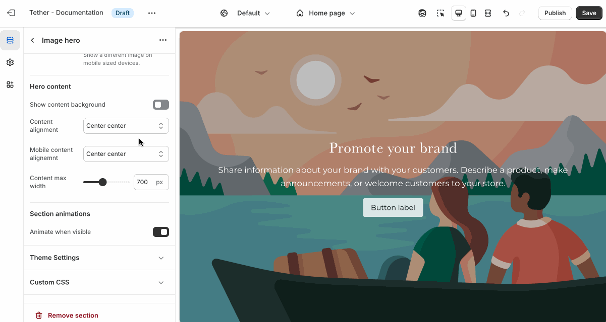
Overlay content settings control how text, buttons, and other elements appear on top of media. These settings allow you to adjust positioning, layout, and readability.
| Setting | Description |
|---|---|
| Show content background | When enabled, displays a background behind text content, using the selected 'Content background color scheme' colors. Helps improve readability over images. |
| Content background color scheme | Select a predefined color scheme for your content and content background. Only applies if 'Show content background' is enabled. |
| Show background gradient | Show your predefined background gradient associated with the selected 'Content background color scheme'. Only applies if 'Show content background' is enabled.. |
| Content alignment | Controls the position of inner content blocks. |
| Mobile content alignment | Adjusts content positioning specifically for mobile devices. |
| Content max width | Sets the maximum width (in pixels) of the text content area. Useful for limiting line length and improving visual layout. |
Visual example.
Blocks - Nested
Blocks are individual content elements that make up parts of a Section layout. Each block controls a specific piece of content, giving you detailed control over how your store looks and functions.
View the Blocks documentation to learn more.