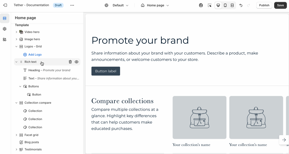
Facet grid
The Facet grid section lets you create a flexible layout of images, videos, and text arranged in rows and columns. It’s ideal for building custom layouts, showcasing a mix of content types, or highlighting multiple features in a clean, structured format.
Settings
| Setting | Description |
|---|---|
| Color scheme | Select a predefined color scheme. |
| Grid display width | Choose whether the grid stays within the theme's normal padding or extends beyond it for a more immersive layout. Extended allows the image to break out of the usual bounds, while within bounds keeps it aligned with the page content. |
| Gap space | Choose between a standard uniform grid spacing or no spacing. |
| Section spacing & border | See shared settings > Section spacing & border. Associated settings below. |
| Section animations | Animate section when scrolled into view. |

Shared settings
These settings are common to several sections and work the same way wherever they appear. Once you learn how they work in one place, you'll recognize them elsewhere.
Spacing and border
The section Spacing & Border settings allow you to control how much vertical space line between your sections. Mix and match to find what works for you. Show a stylistic border between sections to emphasize the break between content.
| Setting | Description |
|---|---|
| Top spacing | How much spacing applies to the top of this section. |
| Bottom spacing | How much spacing applies to the bottom of this section. |
| Show bottom border | Show a stylistic border at the bottom of the section spacing |
Visual example.
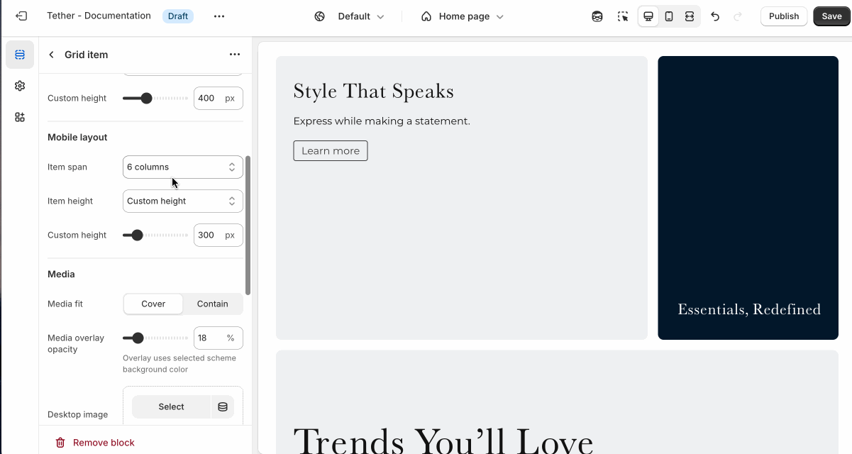
Block - Grid item
The grid is made up of 12 columns. Choose how you want to display your grid item using 'Item span' settings between desktop and mobile screens. Play around with different configurations to develop unique designs.
| Setting | Description |
|---|---|
| Color scheme | Select a predefined color scheme. This scheme applies directly to the Grid item |
| Show background gradient | Show background gradient. Add a pop of color to really bring attention to your stores visitors. Note that the background is only visible if no media has been selected |
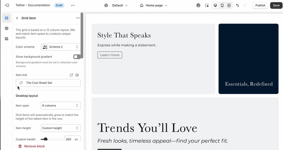
| Item link | Link the entire grid item to a page in your store. |
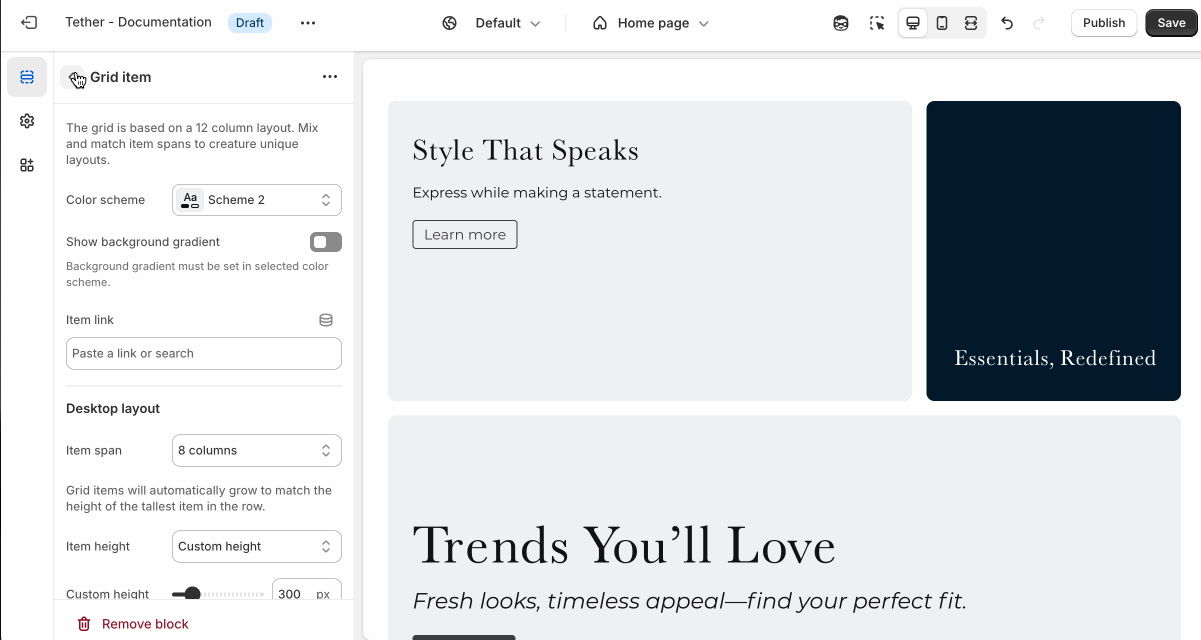
Desktop layout
| Setting | Description |
|---|---|
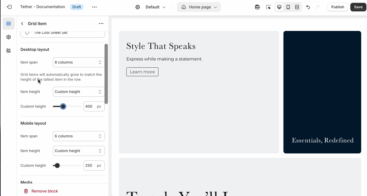
| Item span | Control how many columns based on the 12 column grid the grid item spans on desktop screen sizes. The item span will have direct effects on a grid items neighbouring items. |
| Item height | Choose between having the block items height be set using a custom height, or the media / content used in the Grid item. Note: The tallest grid item in a row will dictate the height of all items in that row. |
| Custom height | Set the custom height for your grid item. Only applies if Item height is set to 'Custom height'. Also only applies if this grid item is the tallest in a row. |
Mobile layout
| Setting | Description |
|---|---|
| Item span | Control how many columns based on the 12 column grid the grid item spans on mobile screen sizes. The item span will have direct effects on a grid items neighbouring items. |
| Item height | Choose between having the block items height be set using a custom height, or the media / content used in the Grid item. Note: The tallest grid item in a row will dictate the height of all items in that row. |
| Custom height | Set the custom height for your grid item. Only applies if Item height is set to 'Custom height'. Also only applies if this grid item is the tallest in a row. |
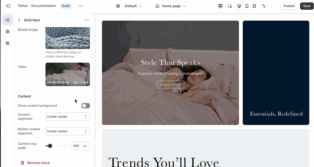
Media
| Setting | Description |
|---|---|
| Media fit | Controls how the media fills its container. Use Cover to crop and fill the space, or Contain to show the entire media without cropping. |
| Item height | Choose between having the block items height be set using a custom height, or the media / content used in the Grid item. Note: The tallest grid item in a row will dictate the height of all items in that row. |
| Media overlay opacity | Adds a semi-transparent overlay on top of the media using the selected scheme background. Use this to improve text readability. |
| Desktop image | Select the default image. |
Mobile image * | Optional. Upload a different image optimized for smaller screens. If left blank, the desktop image will be used on all devices. |
| Video | Show a background video as an alternative to an image. |
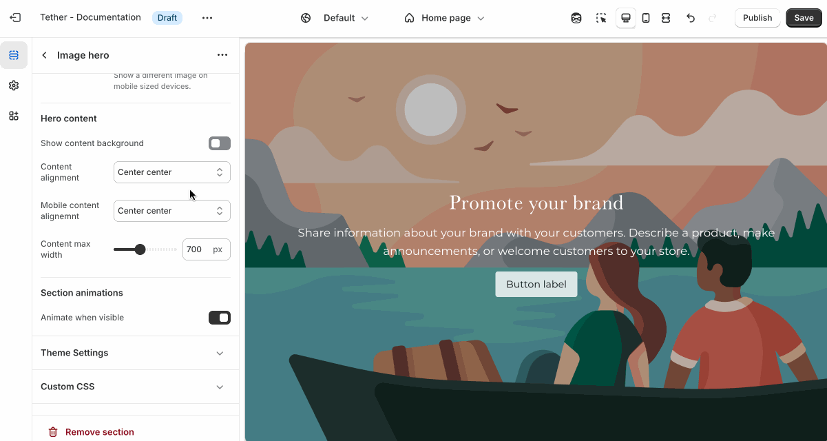
Overlay content
Overlay content settings control how text, buttons, and other elements appear on top of media. These settings allow you to adjust positioning, layout, and readability.
| Setting | Description |
|---|---|
| Show content background | When enabled, displays a background behind text content, using the selected 'Content background color scheme' colors. Helps improve readability over images. |
| Content background color scheme | Select a predefined color scheme for your content and content background. Only applies if 'Show content background' is enabled. |
| Show background gradient | Show your predefined background gradient associated with the selected 'Content background color scheme'. Only applies if 'Show content background' is enabled.. |
| Content alignment | Controls the position of inner content blocks. |
| Mobile content alignment | Adjusts content positioning specifically for mobile devices. |
| Content max width | Sets the maximum width (in pixels) of the text content area. Useful for limiting line length and improving visual layout. |
Visual example.
Blocks - Nested
Blocks are individual content elements that make up parts of a Section layout. Each block controls a specific piece of content, giving you detailed control over how your store looks and functions.
View the Blocks documentation to learn more.