Related products
The Related Products section helps customers discover more items they may be interested in by displaying products related to the one they’re currently viewing. This section can increase engagement and average order value by suggesting complementary or similar products.
By default, related products are automatically generated based on Shopify’s internal logic. For more control, you can use the Shopify Search & Discovery app to manually customize product recommendations and fine-tune what appears based on the displayed product.
This section is only available on the Product page.
Settings
| Setting | Description |
|---|---|
| Color scheme | Select a predefined color scheme. |
| Prelude | See shared settings > Prelude. Associated settings below. |
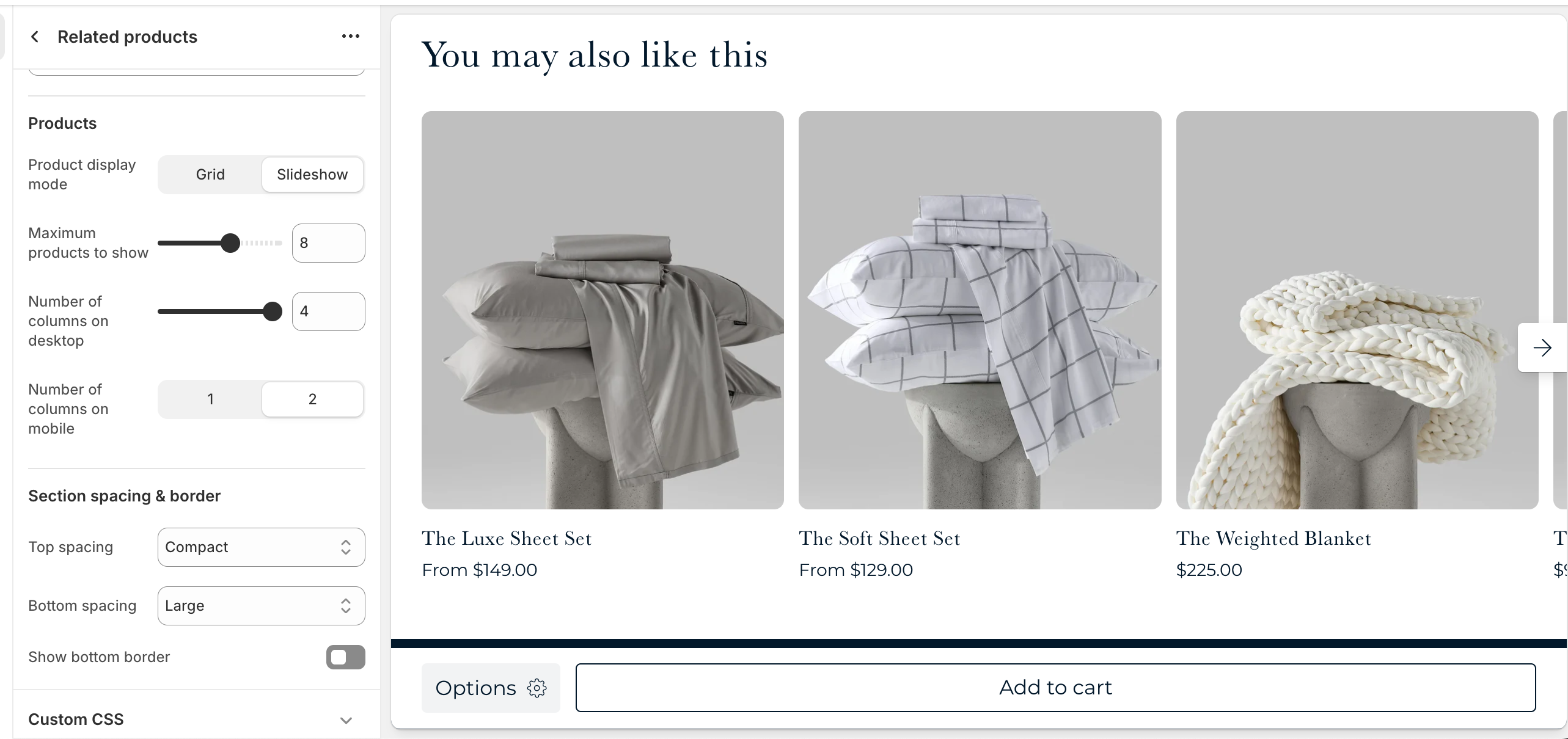
| Product display mode | Choose to display your related products in a grid or slider. |
| Maximum products to show | How many related products you want to show. |
| Number of columns on desktop | Pick how many related products are visible in a row on desktop. |
| Number of columns on mobile | Pick how many related products are visible in a row on mobile. |
| Section spacing & border | See shared settings > Section spacing & border. Associated settings below. |
| Section animations | Animate section when scrolled into view. |
Shared settings
These settings are common to several sections and work the same way wherever they appear. Once you learn how they work in one place, you'll recognize them elsewhere.
Prelude
Use Prelude content to introduce your section. These settings allow you to add a heading, supporting text, and optional call-to-action buttons to introduce the section. Some sections may hide button settings if they aren’t relevant to the layout.
| Setting | Description |
|---|---|
| Alignment | Set the horizontal alignment of the prelude content. |
| Heading + Associated settings | Customize the section heading. Choose between your theme’s body or heading font, adjust the font size, and optionally display the text in all caps for extra emphasis. |
| Text + Associated settings | Customize the text, and size of your text to match your design. |
| Button + Associated settings | Customize the button label, add a button link, adjust the button size, and pick the button style. |
Visual example.
Spacing and border
The section Spacing & Border settings allow you to control how much vertical space line between your sections. Mix and match to find what works for you. Show a stylistic border between sections to emphasize the break between content.
| Setting | Description |
|---|---|
| Top spacing | How much spacing applies to the top of this section. |
| Bottom spacing | How much spacing applies to the bottom of this section. |
| Show bottom border | Show a stylistic border at the bottom of the section spacing |
Visual example.