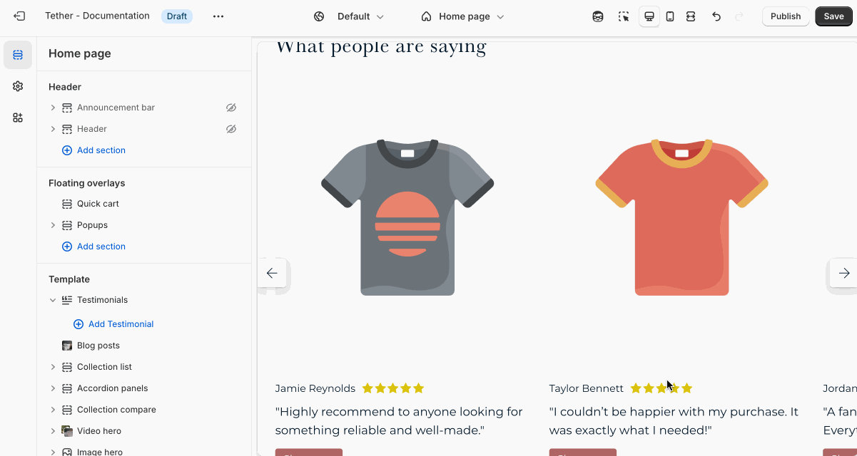
Testimonials
The Testimonials section lets you showcase customer feedback, reviews, or endorsements to build trust and credibility.
Settings
| Setting | Description |
|---|---|
| Color scheme | Select a predefined color scheme. |
| Prelude | See shared settings > Prelude. Associated settings below. |
| Product image aspect ratio | Control the aspect ratio of the testimonial image. |
| Star color | Chose to use the color scheme text color, your accent color, or a custom color for testimonial rating stars. |
| Custom star color | Set the custom star color, only applies if Star color is set to custom. |
| Shop button text | Apply the same label to all Shop buttons that appear below the testimonial item. |
| Shop button size | Control the size of the Shop button |
| Shop button style | Control the style of the Shop button |
| Section spacing & border | See shared settings > Section spacing & border. Associated settings below. |
| Section animations | Animate section when scrolled into view. |
Shared settings
These settings are common to several sections and work the same way wherever they appear. Once you learn how they work in one place, you'll recognize them elsewhere.
Prelude
Use Prelude content to introduce your section. These settings allow you to add a heading, supporting text, and optional call-to-action buttons to introduce the section. Some sections may hide button settings if they aren’t relevant to the layout.
| Setting | Description |
|---|---|
| Alignment | Set the horizontal alignment of the prelude content. |
| Heading + Associated settings | Customize the section heading. Choose between your theme’s body or heading font, adjust the font size, and optionally display the text in all caps for extra emphasis. |
| Text + Associated settings | Customize the text, and size of your text to match your design. |
| Button + Associated settings | Customize the button label, add a button link, adjust the button size, and pick the button style. |
Visual example.
Spacing and border
The section Spacing & Border settings allow you to control how much vertical space line between your sections. Mix and match to find what works for you. Show a stylistic border between sections to emphasize the break between content.
| Setting | Description |
|---|---|
| Top spacing | How much spacing applies to the top of this section. |
| Bottom spacing | How much spacing applies to the bottom of this section. |
| Show bottom border | Show a stylistic border at the bottom of the section spacing |
Visual example.
Block - Testimonial
Create individual testimonials with a quote, customer name, and optional product association. Showing product testimonials highlight real customer experiences and adds social proof to specific items in your store.
| Setting | Description |
|---|---|
| Product | Optionally select a product to use as a focus for your testimonial. |
| Product image | Add a custom image for the assocated product. Great for showing the product in use by the author of the testimonial. |
| Author image | Add a face to bring personality to your testimonial. |
| Author name | Set the name of the author. |
| Show rating | Optionally show the star rating given to the associated product. |
| Star rating | Set the rating for the testimonial. |
| Author title | Set the author title. |
| Quote | Testimonial text content. |