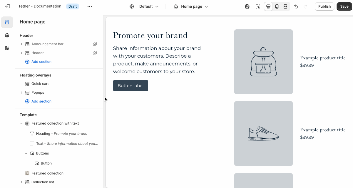
Featured collection with text
The Featured collection with text section showcases products from a selected collection in a single-column layout, alongside nested block content. As customers scroll through the products, the text remains fixed, allowing your message to stay visible. It’s perfect for storytelling, sharing product details, or reinforcing a promotion while shoppers browse.
Settings
| Setting | Description |
|---|---|
| Color scheme | Select a predefined color scheme. |
| Collection position | Choose to display the collection on the right or left of the nested block content. Applies only on desktop screens. |
| Sticky text on scroll | Enables the nested block content remaining focused while a user scrolls through the section. |
| Text horizontal alignment | Nested blocks content horizontal alignment. |
| Text vertical alignment | Where the nested block content is vertically aligned within the section. Note this will effect where the block content remains while scrolling if Sticky text on scroll is enabled. |
| Collection | Select a collection to feature. Products will be pulled automatically based on the collection’s settings. |
| Product list | Manually choose specific products to feature, instead of pulling them from a collection. |
| Section spacing & border | See shared settings > Section spacing & border. Associated settings below. |
| Section animations | Animate section when scrolled into view. |
Shared settings
These settings are common to several sections and work the same way wherever they appear. Once you learn how they work in one place, you'll recognize them elsewhere.
Spacing and border
The section Spacing & Border settings allow you to control how much vertical space line between your sections. Mix and match to find what works for you. Show a stylistic border between sections to emphasize the break between content.
| Setting | Description |
|---|---|
| Top spacing | How much spacing applies to the top of this section. |
| Bottom spacing | How much spacing applies to the bottom of this section. |
| Show bottom border | Show a stylistic border at the bottom of the section spacing |
Visual example.
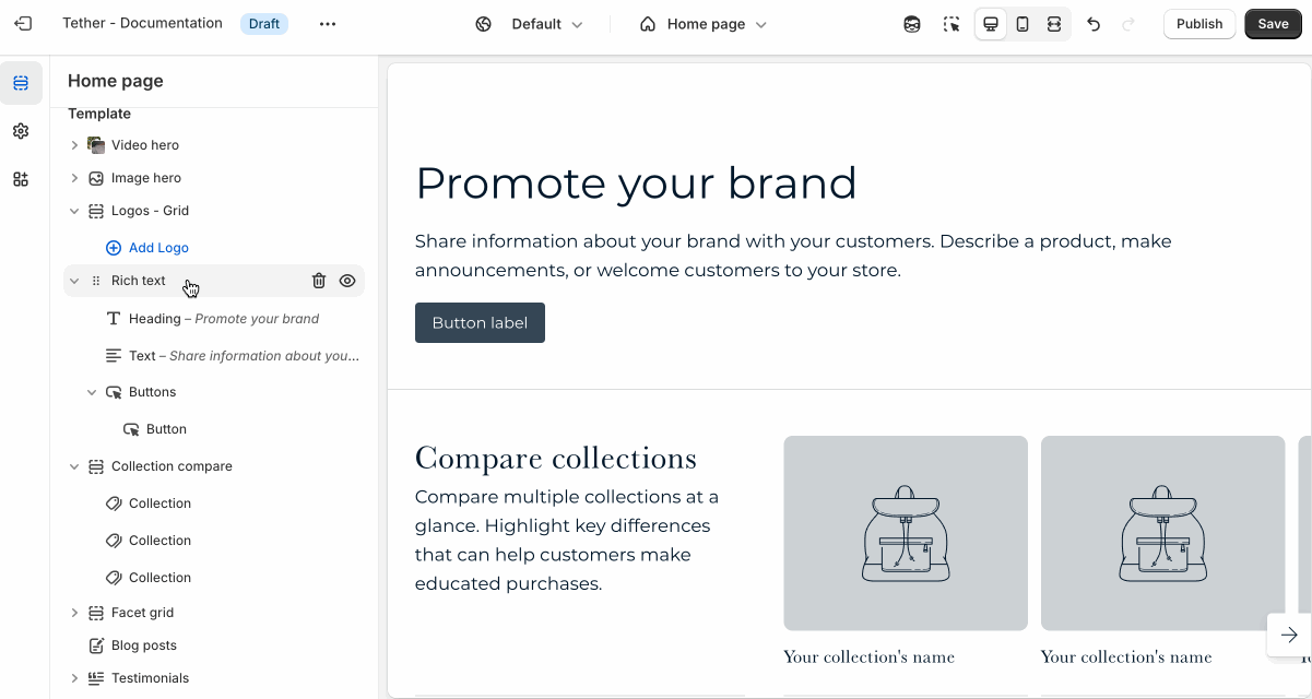
Blocks - Nested
Blocks are individual content elements that make up parts of a Section layout. Each block controls a specific piece of content, giving you detailed control over how your store looks and functions.
View the Blocks documentation to learn more.