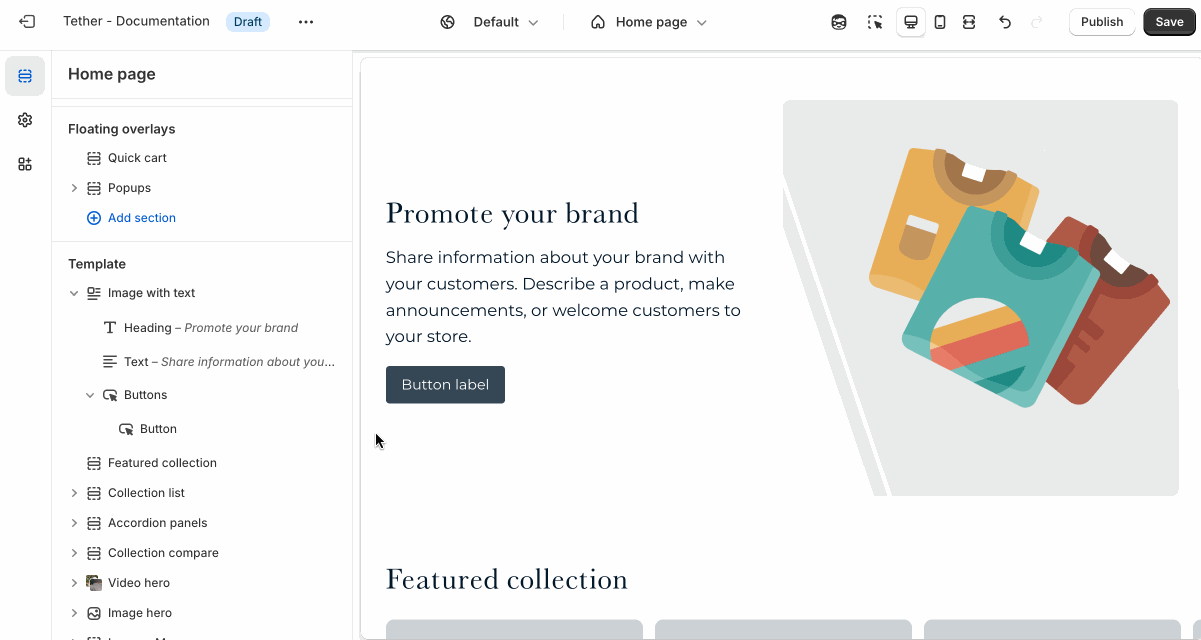
Image with text
The Image with text section pairs a large image with nested block content to help tell your brand story, highlight a feature, or promote a product or collection. You can also choose to make the text sticky as the customer scrolls, keeping your message in view for longer.
Settings
| Setting | Description |
|---|---|
| Color scheme | Select a predefined color scheme. |
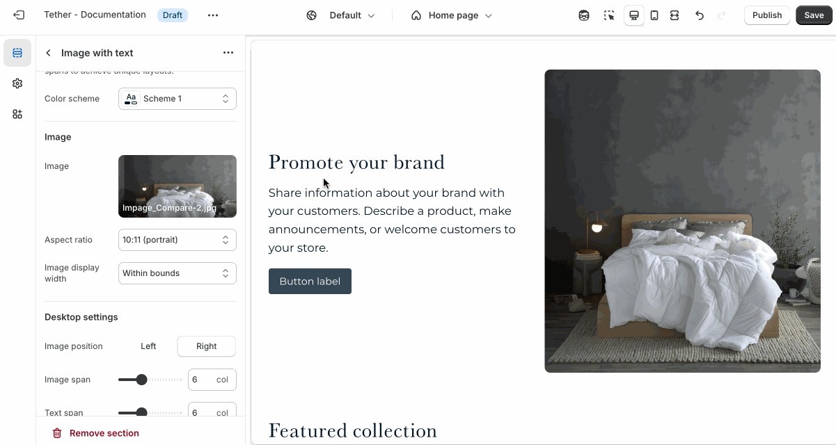
| Image | Select your default image. |
| Aspect ratio | Control the aspect ratio of the default image. |
| Image display width | Choose whether the image stays within the theme's normal padding or extends beyond it for a more immersive layout. Extended allows the image to break out of the usual bounds, while within bounds keeps it aligned with the page content. |
| Desktop settings | See all Desktop settings |
| Mobile settings | See all Mobile settings |
| Section spacing & border | See shared settings > Section spacing & border. Associated settings below. |
| Section animations | Animate section when scrolled into view. |
Desktop settings
The Image with text section is based on a 12 column grid, making it incredibly versatile when used to overlay text content on imagery. Break out of the typical ridgid design and experiment with overlaying content where you can.
| Setting | Description |
|---|---|
| Image position | Choose to display the image on the right or left of the nested block content. |
| Image span | How many columns of the 12 column grid the image should take up. |
| Text span | How many columns of the 12 column grid the text should take up. |
| Sticky text on scroll | Enables the nested block content remaining focused while a user scrolls through the section. |
| Text horizontal alignment | Nested blocks content horizontal alignment. |
| Text vertical alignment | Where the nested block content is vertically aligned within the section. Note this will effect where the block content remains while scrolling if Sticky text on scroll is enabled. |
Mobile settings
| Setting | Description |
|---|---|
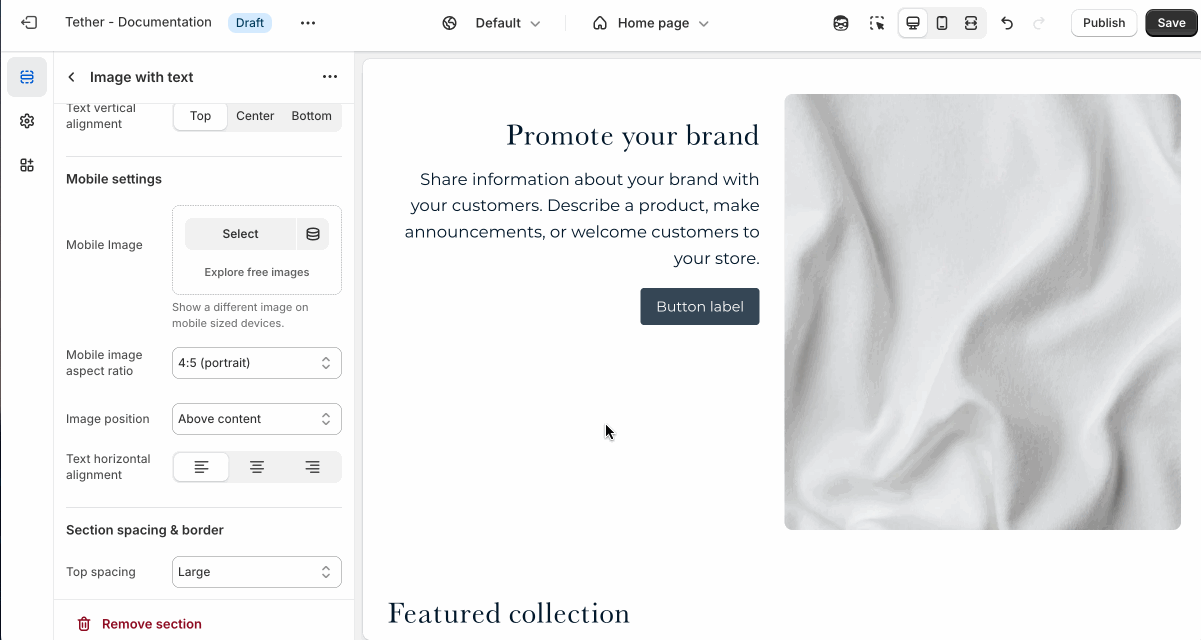
| Mobile image | Upload a different image optimized for smaller screens. If left blank, the default image will be used on all devices. |
| Aspect ratio | Control the aspect ratio of the mobile image. |
| Image position | Choose to display the image above or below the nested block content. |
| Text horizontal alignment | Nested blocks content horizontal alignment on mobile screens. |
Shared settings
These settings are common to several sections and work the same way wherever they appear. Once you learn how they work in one place, you'll recognize them elsewhere.
Spacing and border
The section Spacing & Border settings allow you to control how much vertical space line between your sections. Mix and match to find what works for you. Show a stylistic border between sections to emphasize the break between content.
| Setting | Description |
|---|---|
| Top spacing | How much spacing applies to the top of this section. |
| Bottom spacing | How much spacing applies to the bottom of this section. |
| Show bottom border | Show a stylistic border at the bottom of the section spacing |
Visual example.
Blocks - Nested
Blocks are individual content elements that make up parts of a Section layout. Each block controls a specific piece of content, giving you detailed control over how your store looks and functions.
View the Blocks documentation to learn more.