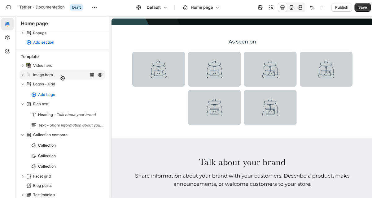
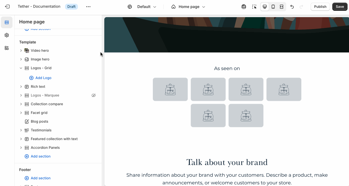
Logos grid
The Logos grid section displays grid of sponsor or brand logos. It's designed to highlight partnerships, featured brands, or trusted affiliations in a way that's visually engaging and space-efficient.
Settings
| Setting | Description |
|---|---|
| Color scheme | Select a predefined color scheme. |
| Content container | See shared settings > Content container. Associated settings below. |
| Prelude | See shared settings > Prelude. Associated settings below. |
| Number of columns on mobile | How many logos are visible in a row on mobile. Keeps logo size consistent between rows. |
| Desktop max width | Set the desktop width of all logos in a single location. Ensures consistency across all logos at desktop screen sizes. |
| Section spacing & border | See shared settings > Section spacing & border. Associated settings below. |
| Section animations | Animate section when scrolled into view. |
Shared settings
These settings are common to several sections and work the same way wherever they appear. Once you learn how they work in one place, you'll recognize them elsewhere.
Content container
These settings control the width and alignment of the content within the section.
| Setting | Description |
|---|---|
| Content max width | Choose whether the content spans the full width of the section, or use a custom width. |
| Custom width | When "Custom width" is selected, this sets the maximum content width in pixels. |
| Custom width container alignment | Controls how the custom-width content is aligned within the section: left, center, or right. |
Visual example.
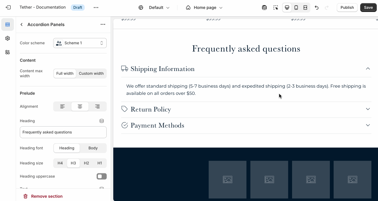
Prelude
Use Prelude content to introduce your section. These settings allow you to add a heading, supporting text, and optional call-to-action buttons to introduce the section. Some sections may hide button settings if they aren’t relevant to the layout.
| Setting | Description |
|---|---|
| Alignment | Set the horizontal alignment of the prelude content. |
| Heading + Associated settings | Customize the section heading. Choose between your theme’s body or heading font, adjust the font size, and optionally display the text in all caps for extra emphasis. |
| Text + Associated settings | Customize the text, and size of your text to match your design. |
| Button + Associated settings | Customize the button label, add a button link, adjust the button size, and pick the button style. |
Visual example.
Spacing and border
The section Spacing & Border settings allow you to control how much vertical space line between your sections. Mix and match to find what works for you. Show a stylistic border between sections to emphasize the break between content.
| Setting | Description |
|---|---|
| Top spacing | How much spacing applies to the top of this section. |
| Bottom spacing | How much spacing applies to the bottom of this section. |
| Show bottom border | Show a stylistic border at the bottom of the section spacing |
Visual example.
Block - Logo
Each Logo block contains a single logo image, with an optional link.