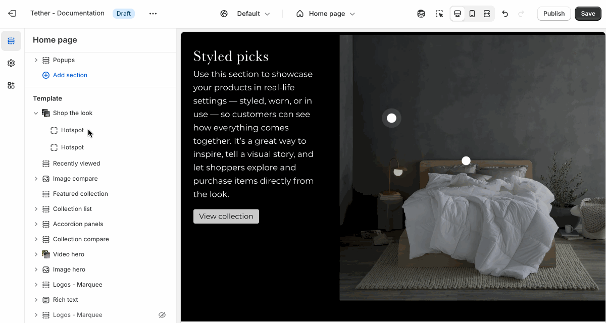
Shop the look
The Shop the look section allows you to showcase a styled image, and tag individual products featured in the scene. Customers can browse the full look and quickly add items to their cart, making it easy to shop complete outfits or coordinated sets. It’s a great way to inspire purchases and highlight how products work together in context.
Settings
| Setting | Description |
|---|---|
| Color scheme | Select a predefined color scheme. |
| Image | See all image settings |
| Content | See all content settings |
| Shop button style | Control the style of the Shop button |
| Section spacing & border | See shared settings > Section spacing & border. Associated settings below. |
| Section animations | Animate section when scrolled into view. |
Image settings
| Setting | Description |
|---|---|
| Image color scheme | Select a predefined color scheme for the image. |
| Image position | Choose to display the image on the right or left of content. |
| Image display width | Choose whether the image stays within the theme's normal padding or extends beyond it for a more immersive layout. Extended allows the image to break out of the usual bounds, while within bounds keeps it aligned with the page content. |
| Image overlay opacity | Adds a semi-transparent overlay on top of the image using the selected scheme background. Use this to improve text readability. |
| Image | Select your default image. |
| Aspect ratio | Control the aspect ratio of the default image. |
| Mobile image | Upload a different image optimized for smaller screens. If left blank, the default image will be used on all devices. |
| Mobile image aspect ratio | Control the aspect ratio of the mobile image. |
Content settings
| Setting | Description |
|---|---|
| Heading + Associated settings | Customize the section heading. Choose between your theme’s body or heading font, adjust the font size, and optionally display the text in all caps for extra emphasis. |
| Text + Associated settings | Customize the text, and size of your text to match your design. |
| Button + Associated settings | Customize the button label, add a button link, adjust the button size, and pick the button style. |
Shared settings
These settings are common to several sections and work the same way wherever they appear. Once you learn how they work in one place, you'll recognize them elsewhere.
Spacing and border
The section Spacing & Border settings allow you to control how much vertical space line between your sections. Mix and match to find what works for you. Show a stylistic border between sections to emphasize the break between content.
| Setting | Description |
|---|---|
| Top spacing | How much spacing applies to the top of this section. |
| Bottom spacing | How much spacing applies to the bottom of this section. |
| Show bottom border | Show a stylistic border at the bottom of the section spacing |
Visual example.
Block - Hotspot
Each Hotspot lets you tag a product on the main image by placing a clickable marker. You can position the hotspot anywhere on the image. This allows customers to explore and shop the look directly by clicking on the items they see.
Clicking on the hotspot will overlay the content with a coursel of products on desktop sizes and open a drawer showing your product on mobile.
| Setting | Description |
|---|---|
| Product | Select a product to be shown when the hotspot is clicked. |
| Hotspot horizontal location | Control where the hotspot is located horizontally within the image. |
| Hotspot vertical location | Control where the hotspot is located vertically within the image. |
| Mobile image hotspots | Note These values will only apply if you have uploaded a mobile image. |
| Hotspot horizontal location | Control where the hotspot is located horizontally within the image on mobile sized screen. |
| Hotspot vertical location | Control where the hotspot is located vertically within the image on mobile sized screen. |