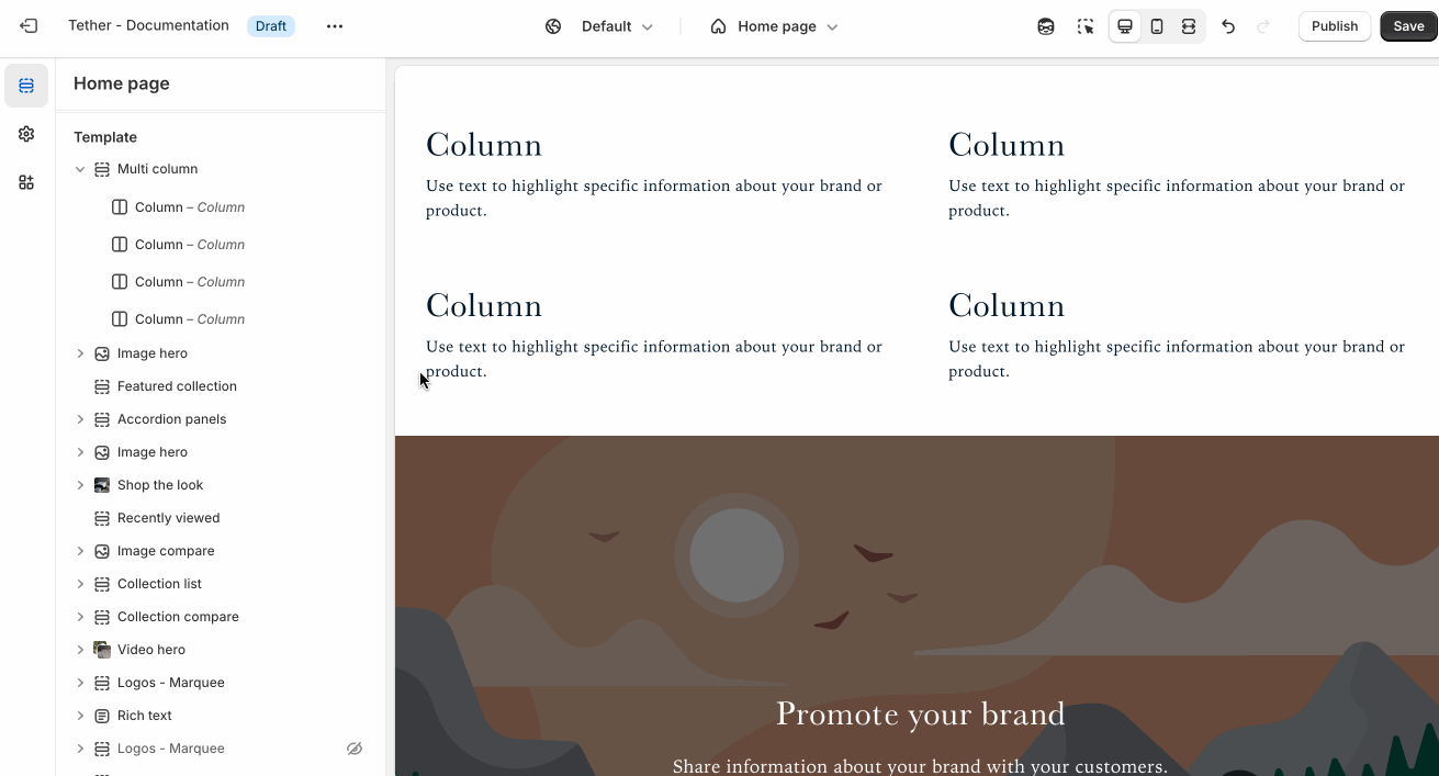
Multi column
The Multi column section lets you display content side by side in two, three, or more columns—perfect for showcasing features, services, icons, or any content that benefits from a clean, structured layout.
Settings
| Setting | Description |
|---|---|
| Color scheme | Select a predefined color scheme. |
| Prelude | See shared settings > Prelude. Associated settings below. |
| Content settings | See all Content settings |
| Desktop layout settings | See all Desktop layout settings |
| Mobile layout settings | See all Mobile layout settings |
| Section spacing & border | See shared settings > Section spacing & border. Associated settings below. |
| Section animations | Animate section when scrolled into view. |
Content settings
Content settigns apply across all columns ensuring uniformity in your designs.
| Setting | Description |
|---|---|
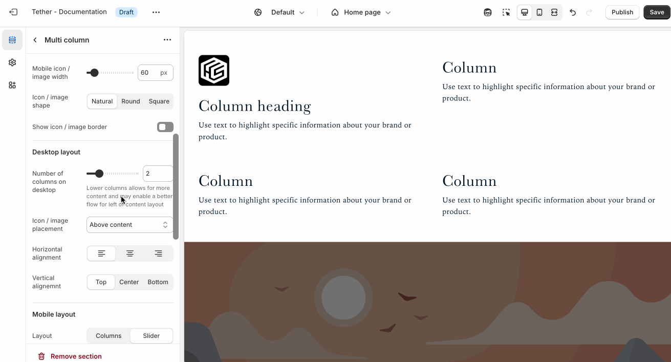
| Icon / image width | Set the icon / image width across all columns. Applies to desktop size screens. |
| Mobile icon / image width | Set the mobile icon / image width across all columns. Applies to mobile size screens. |
| Icon / image shape | Control the shape of your imagery, useful when not all content is the same. |
| Show icon / image border | Display a border around your imagery. |
| Border weight | The thickness of the optional border. |
| Border padding | The spacing between your border and the inner icon / image. |
Desktop layout settings
| Setting | Description |
|---|---|
| Number of columns on desktop | How many columns your content spans on desktop screen sizes. |
| Icon / image placement | Choose between showcasing your imagery above or next to your columns. |
| Horizontal alignment | Choose how you want your content to align horizontally. |
| Vertical alignment | Choose how you want your content align vertically in each row. |
Smaller imagery and lower column counts work better for the 'Left of content' placement setting.
Mobile layout settings
| Setting | Description |
|---|---|
| Layout | Choose to display your mobile content as a grid or within a slideshow |
| Number of columns on desktop | How many columns your content spans on desktop screen sizes. Only applies if Layout is set to 'Columns' |
| Icon / image placement | Choose between showcasing your imagery above or next to your columns. |
| Horizontal alignment | Choose how you want your content to align horizontally. |
| Vertical alignment | Choose how you want your content align vertically in each row. |

Shared settings
These settings are common to several sections and work the same way wherever they appear. Once you learn how they work in one place, you'll recognize them elsewhere.
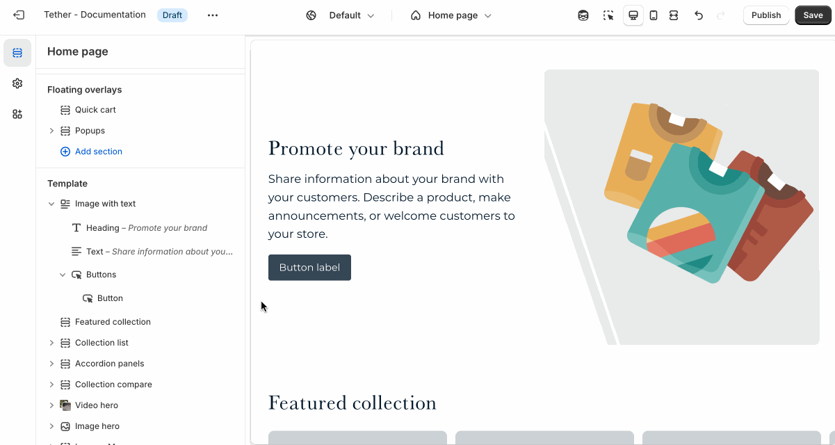
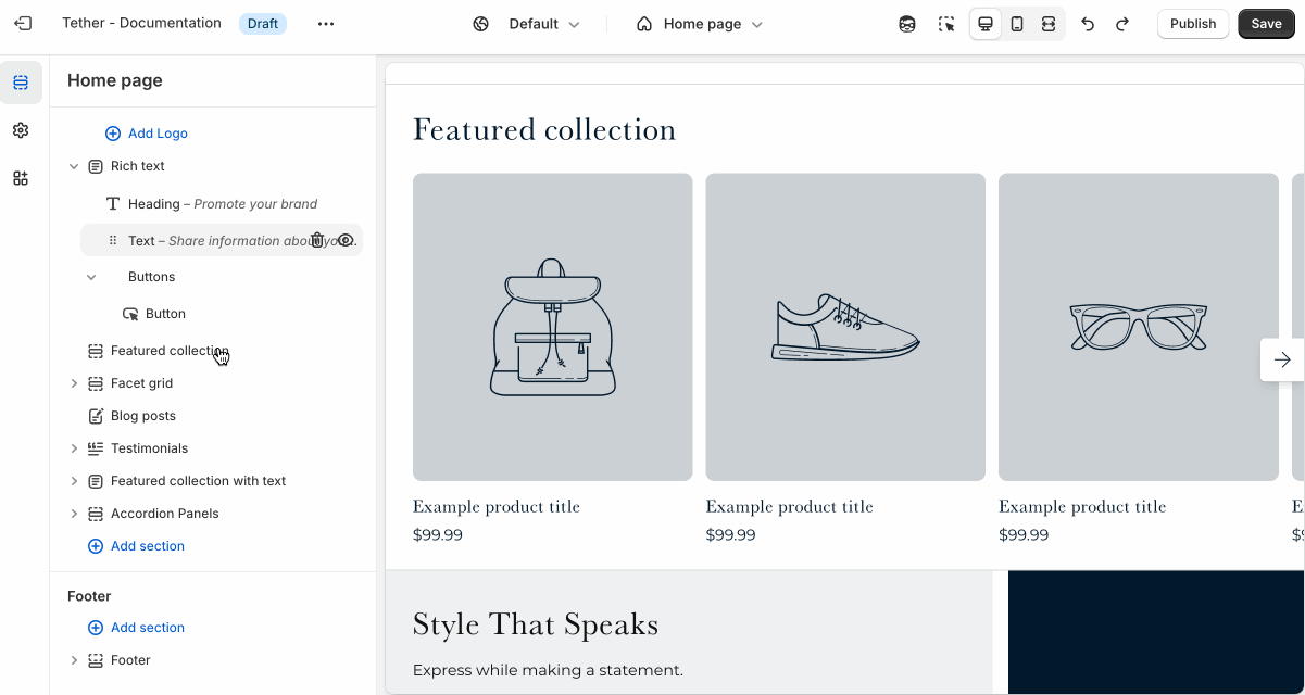
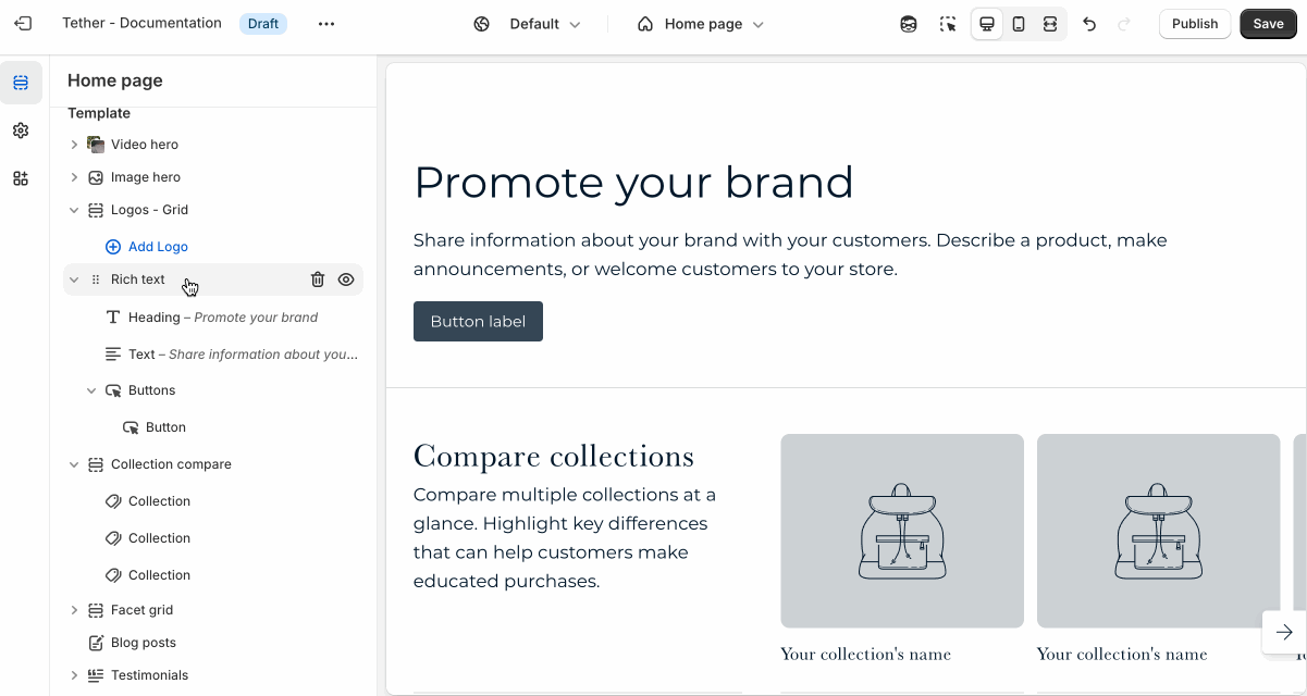
Prelude
Use Prelude content to introduce your section. These settings allow you to add a heading, supporting text, and optional call-to-action buttons to introduce the section. Some sections may hide button settings if they aren’t relevant to the layout.
| Setting | Description |
|---|---|
| Alignment | Set the horizontal alignment of the prelude content. |
| Heading + Associated settings | Customize the section heading. Choose between your theme’s body or heading font, adjust the font size, and optionally display the text in all caps for extra emphasis. |
| Text + Associated settings | Customize the text, and size of your text to match your design. |
| Button + Associated settings | Customize the button label, add a button link, adjust the button size, and pick the button style. |
Visual example.
Spacing and border
The section Spacing & Border settings allow you to control how much vertical space line between your sections. Mix and match to find what works for you. Show a stylistic border between sections to emphasize the break between content.
| Setting | Description |
|---|---|
| Top spacing | How much spacing applies to the top of this section. |
| Bottom spacing | How much spacing applies to the bottom of this section. |
| Show bottom border | Show a stylistic border at the bottom of the section spacing |
Visual example.
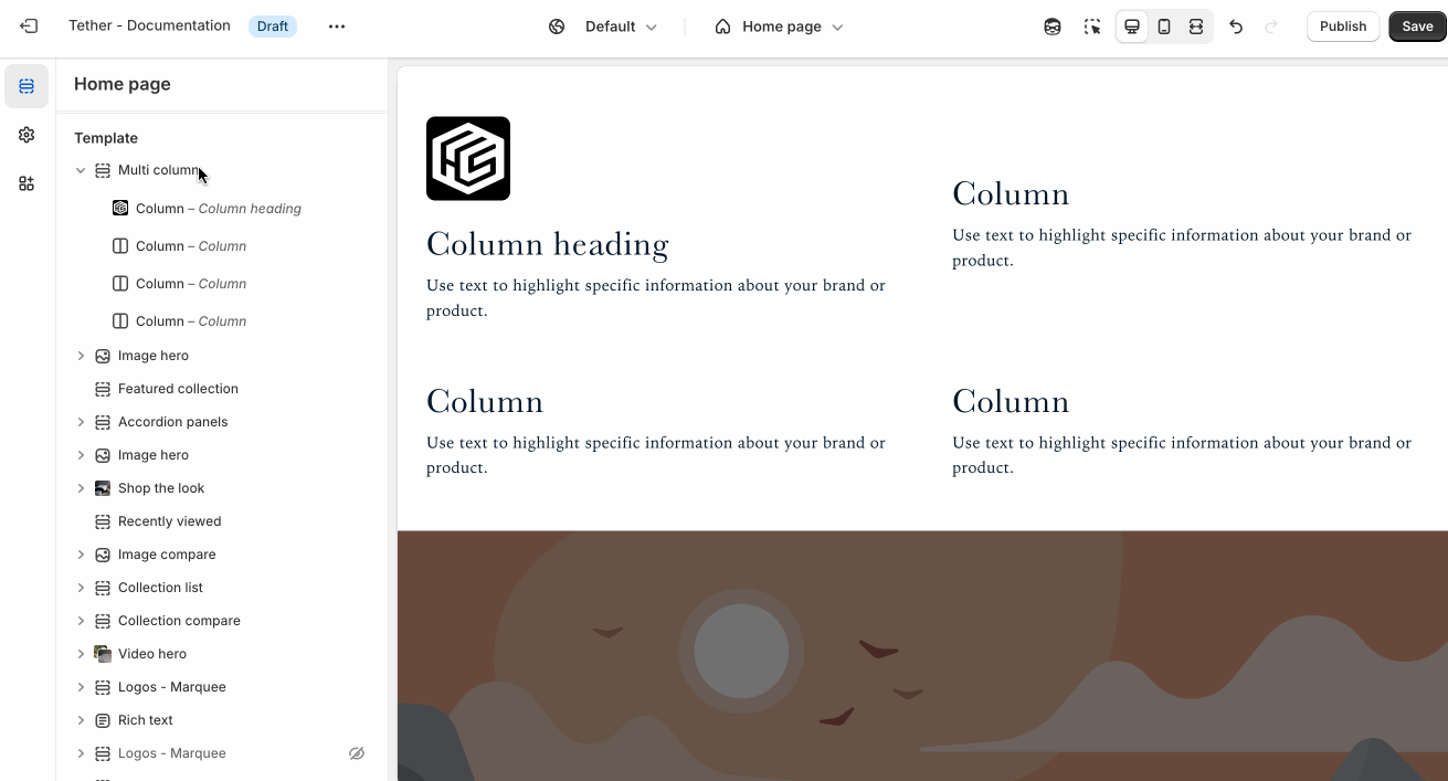
Block - Column
| Setting | Description |
|---|---|
| Icon | This dropdown lets you optionally choose from a curated set of icons that are designed to look great with your theme. |
| Image | Optionally use a custom image / icon. Icon must be set to 'None' |
| Heading + Associated settings | Customize the section heading. Choose between your theme’s body or heading font, adjust the font size, and optionally display the text in all caps for extra emphasis. |
| Text + Associated settings | Customize the text, and size of your text to match your design. |