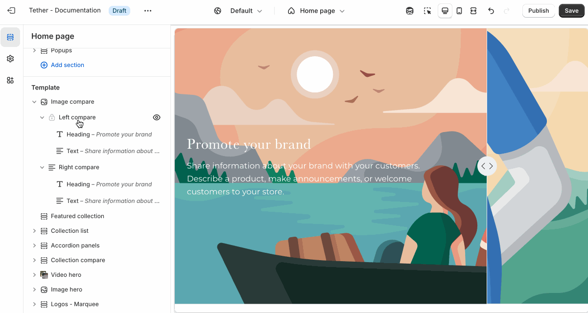
Image compare
The Image compare section lets customers interactively slide between two images—perfect for showing before-and-after shots, product variations, or design changes in a visual and engaging way.
Settings
| Setting | Description |
|---|---|
| Color scheme | Select a predefined color scheme. |
| Prelude | See shared settings > Prelude. Associated settings below. |
| Aspect ratio | Control the aspect ratio of images on both image comparisons. |
| Image display width | Choose whether the images stay within the theme's normal padding or extends beyond it for a more immersive layout. Extended allows the image to break out of the usual bounds, while within bounds keeps it aligned with the page content. |
| Starting reveal amount | Choose how much of the left or right image is revealed without user interaction. |
| Reveal content threshold | Each compare image content shows when a specific amount of that side has been revealed. This setting controls the amount needed to be visible to show the content. Show initial content without interaction by setting the 'Starting reveal amount' higher than the threshold. |
| Section spacing & border | See shared settings > Section spacing & border. Associated settings below. |
| Section animations | Animate section when scrolled into view. |

Shared settings
These settings are common to several sections and work the same way wherever they appear. Once you learn how they work in one place, you'll recognize them elsewhere.
Prelude
Use Prelude content to introduce your section. These settings allow you to add a heading, supporting text, and optional call-to-action buttons to introduce the section. Some sections may hide button settings if they aren’t relevant to the layout.
| Setting | Description |
|---|---|
| Alignment | Set the horizontal alignment of the prelude content. |
| Heading + Associated settings | Customize the section heading. Choose between your theme’s body or heading font, adjust the font size, and optionally display the text in all caps for extra emphasis. |
| Text + Associated settings | Customize the text, and size of your text to match your design. |
| Button + Associated settings | Customize the button label, add a button link, adjust the button size, and pick the button style. |
Visual example.
Spacing and border
The section Spacing & Border settings allow you to control how much vertical space line between your sections. Mix and match to find what works for you. Show a stylistic border between sections to emphasize the break between content.
| Setting | Description |
|---|---|
| Top spacing | How much spacing applies to the top of this section. |
| Bottom spacing | How much spacing applies to the bottom of this section. |
| Show bottom border | Show a stylistic border at the bottom of the section spacing |
Visual example.
Block - Left / Right compare
Settings are identical for the Left and Right compare blocks.
| Setting | Description |
|---|---|
| Color scheme | Select a predefined color scheme. |
| Image | Set your comparison image. |
| Image overlay opacity | Adds a semi-transparent overlay on top of the image using the selected scheme background. Use this to improve text readability. |
| Vertical content alignment | Control how your nested content block align vertically within the comparison image. |