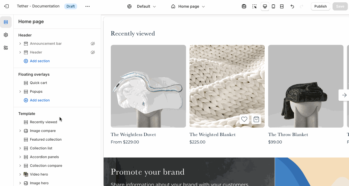
Recently viewed
The Recently viewed section shows customers the items they’ve recently looked at while browsing your store. This makes it easier for shoppers to return to products they were interested in without needing to search again—helping reduce friction and improve the shopping experience. It’s especially useful on longer shopping journeys or stores with large product catalogs.
The recently viewed section will not be visible to users until they have viewed a product page.
Settings
| Setting | Description |
|---|---|
| Color scheme | Select a predefined color scheme. |
| Prelude | See shared settings > Prelude. Associated settings below. |
| Product display mode | Choose to display your products in a grid or slider. |
| Maximum products to show | How many recently viewed products you want to show. |
| Number of columns on desktop | Pick how many products are visible in a row on desktop. |
| Number of columns on mobile | Pick how many products are visible in a row on mobile. |
| Section spacing & border | See shared settings > Section spacing & border. Associated settings below. |
| Section animations | Animate section when scrolled into view. |
Shared settings
These settings are common to several sections and work the same way wherever they appear. Once you learn how they work in one place, you'll recognize them elsewhere.
Prelude
Use Prelude content to introduce your section. These settings allow you to add a heading, supporting text, and optional call-to-action buttons to introduce the section. Some sections may hide button settings if they aren’t relevant to the layout.
| Setting | Description |
|---|---|
| Alignment | Set the horizontal alignment of the prelude content. |
| Heading + Associated settings | Customize the section heading. Choose between your theme’s body or heading font, adjust the font size, and optionally display the text in all caps for extra emphasis. |
| Text + Associated settings | Customize the text, and size of your text to match your design. |
| Button + Associated settings | Customize the button label, add a button link, adjust the button size, and pick the button style. |
Visual example.
Spacing and border
The section Spacing & Border settings allow you to control how much vertical space line between your sections. Mix and match to find what works for you. Show a stylistic border between sections to emphasize the break between content.
| Setting | Description |
|---|---|
| Top spacing | How much spacing applies to the top of this section. |
| Bottom spacing | How much spacing applies to the bottom of this section. |
| Show bottom border | Show a stylistic border at the bottom of the section spacing |
Visual example.