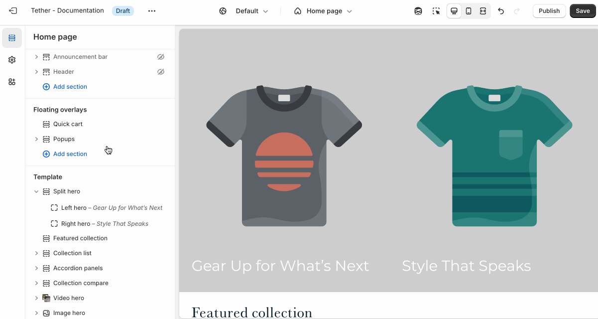
Split hero
The Split hero section displays two images side by side with text content within them. It’s a bold, modern layout ideal for showcasing dual product lines, contrasting visuals, or creating visual symmetry while delivering a central message.
Settings
Each hero side controls specific settings. Only over overarching settings are set at the section level.
| Setting | Description |
|---|---|
| Aspect ratio | Control the aspect ratio of images on both sides of the hero. |
| Mobile aspect ratio | Control the aspect ratio of the images when they break to a stacked layout on mobile sizes screens. |
| Section animations | Animate section when scrolled into view. |

Block - Left / Right hero
Settings are identical for the Left and Right hero blocks.
| Setting | Description |
|---|---|
| Color scheme | Select a predefined color scheme. The background color is used for overlays. |
| Desktop image | Select the default image. |
Mobile image * | Optional. Upload a different image optimized for smaller screens. If left blank, the desktop image will be used on all devices. |
| Image overlay opacity | Adds a semi-transparent overlay on top of the image using the selected scheme background. Use this to improve text readability. |
| Heading + Associated settings | Customize the hero heading. Choose between your theme’s body or heading font, adjust the font size, and optionally display the text in all caps for extra emphasis. |
| Link | Wrap the entire hero in a link. Choose to display a button by setting the button text. |
| Button + Associated settings | Customize the button label, add a button link, adjust the button size, and pick the button style. |